

When was the last time you read a long article online from start to finish, without seeing any images?
Most information today is communicated online via web articles and blogs—like this one—using a combination of text and images or graphics.
Why is this?
One reason is that infographics are liked and shared three times more than other content online. What’s more, a good-quality infographic is 30 times more likely to be read than an article.1
Infographics also make content more accessible, which makes them ideal for students with limited vocabulary and grammar. The more accessible the information, the more engaged the students, and the more likely they’ll be able to retain the information.
Here’s an infographic from our new series, 21st Century Communication 2nd Edition. It compares attitudes toward different job titles in countries around the world.
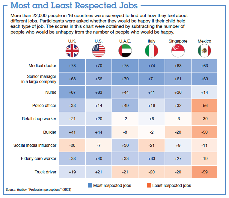
Depending on students’ level, we could use an infographic like this in different ways:
- Introducing vocabulary related to job types (manager, officer, builder, etc.)
- Presenting language for describing statistics (The majority of people in…)
- Teaching language for comparisons and contrast (Whereas… / On the other hand…)
- Developing higher-order thinking skills, such as inference (What do you think is the reason for…?)
- Providing the basis for an out-of-class survey assignment
So, infographics are useful not only for practicing language; they’re also great for developing academic skills, stimulating higher-order thinking skills, and promoting discussion.
Learn more about using infographics to enhance learning in our webinar with Sean Bermingham and Melissa Pang:
“Let’s Get Organized! Using Graphic Organizers to Develop Academic Skills”
Let’s look at some other examples of infographics. We can think of visual information as serving three purposes:
1. Visualizing data
Perhaps the most common type of infographic is a chart summarizing numerical data, such as the results of a survey. For example, a bar chart like this one:
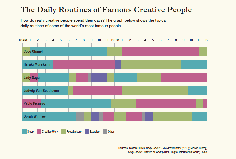
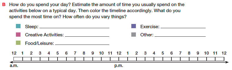
Describing daily routines might seem quite a dry topic for a lesson: I spend X hours a week sleeping. / I work from 9 to 5. Using an infographic like this can help turn an ordinary topic into a springboard for discussion – even at a low proficiency level.
To make the class even more interactive, you could do a short quiz using the information in the infographic. For example, you could ask questions like “Who prefers to do their creative work late at night or very early in the morning?” For more advanced learners, you could expand on the quiz by asking open-ended questions such as “Why do you think Haruki Murakami prefers to work in the early morning?”
Infographics are also ideal for developing analytical skills. In the example below, students are asked to look for information within the infographic. To answer the questions, they have to examine the data, extract the relevant parts, and compare the information to form a conclusion.
Analyzing and interpreting charts like these is not only a useful academic skill – it’s increasingly important for succeeding in standardized exams, such as Writing Task 1 in the IELTS Academic Module.
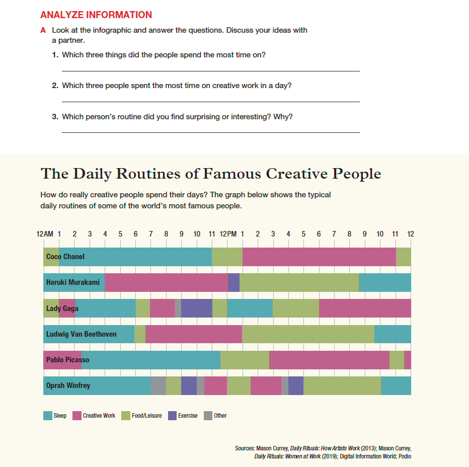
In addition, after students have worked with the infographic, they are asked to create a schedule to show what their typical day looks like. This allows students to apply their understanding of the infographic and personalize the information.
2. Categorizing information
Visuals like T-charts are great for comparing sets of information. Here’s an example showing differences in generational attitudes toward work:
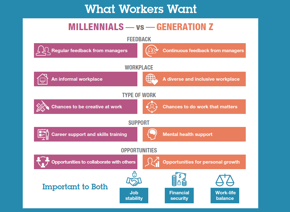
Like the first example in the previous section, we could use an infographic like this to practice language such as generalizing or comparing (Millennials generally want… / Both millennials and Gen Z think that…).
We could also have students evaluate how accurate or reliable the information is, and to what extent they agree based on their own experiences.
For infographics that include terms that students may be unfamiliar with, it’s often useful to include icons to aid comprehension.
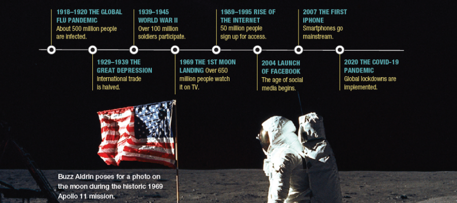
3. Sequencing information
The third main type of infographic places information in some kind of order.
This could be steps in a process or events in a timeline, like in this example:
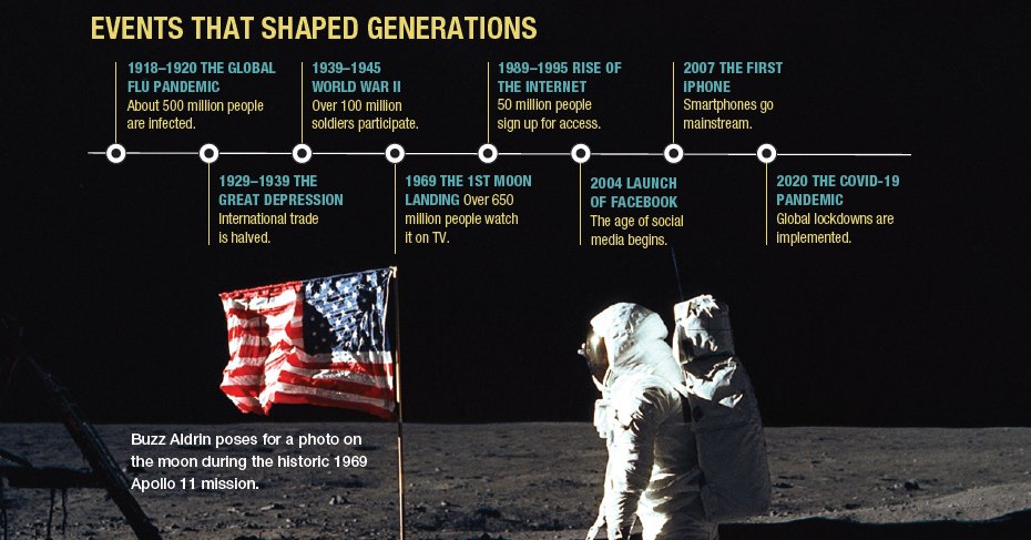
After analyzing the infographic, we could have students personalize it by creating and sharing their own timeline – events that have been significant to them in their own lifetime.
Flow charts and process diagrams are especially good types of infographics for critical thinking. Here’s an example that shows how e-waste has become a global problem.
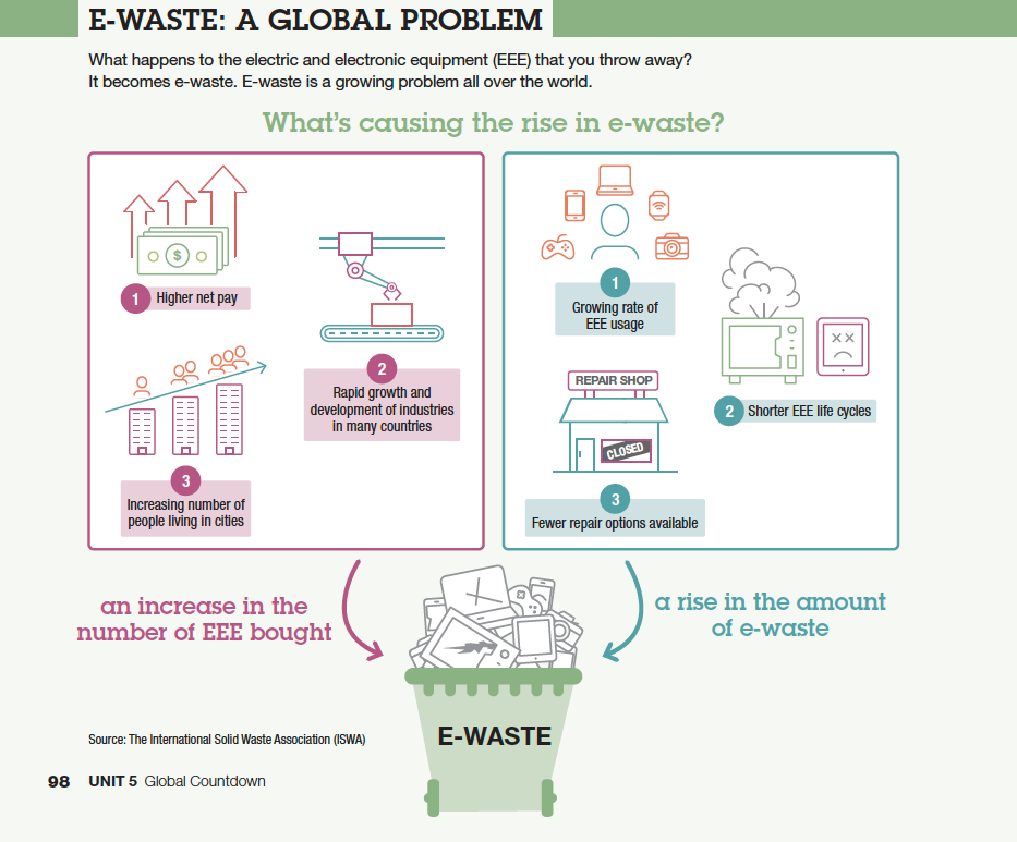
In addition to identifying cause-and-effect relationships in the infographic, we could use it as a springboard to discuss possible solutions to the issue.
If you have experience using other types of infographics in your classroom, feel free to share them in the comments below!
Ready to make the most of infographics?
Whatever the type of infographic, here are some general tips on how to make the best use of them in class.
- Keep the infographic simple – include only the most relevant content and use colors and icons to aid learners’ comprehension.
- If teaching online or with a projector, consider revealing the infographic in stages, and have students guess or predict content before you reveal it.
- Pre-teach language that’s important for understanding the key content, especially any essential topic vocabulary.
- Present language for students to be able to describe or discuss the information – for example, sentence frames or starters for giving an opinion or describing a trend.
- Provide templates so students can create their own infographic (pie chart, flow chart, timeline, etc). There are several sites online that offer free infographic templates, and the Smart Shapes function in MS Word and PowerPoint also allows you to create simple graphic organizers. Check out the resources below to get started!
Resources
- Graphic Organizer Maker: https://graphicorganizer.net/
- Canva: https://www.canva.com/graphic-organizers/templates/
- FigJam: https://www.figma.com/figjam/
- Microsoft tools (Smart Art)
As seen from the examples from 21st Century Communication 2nd Edition, incorporating infographics in the ELT classroom can be a powerful tool for enhancing language learning and communication skills. And with the support of materials like 21st Century Communication and its resources on the online Spark platform, educators can unlock new opportunities for engaging, interactive, and effective language learning.
To read more about using visuals in class and developing students’ visual literacy, check out this blog post: 3 Tips to Improve Visual Literacy in the ELT Classroom
Teach students to think critically and communicate confidently in today’s academic and professional landscape with 21st Century Communication, 2nd Edition!